Brief
The goal of this project focused on redesigning the website for PCV Records, an independant record store downtown Oakville. The challenge was to create a website that allowed customers to easily view in-store product, improve the navigation, and create a stronger online presence.
Problem Statement
How might we redesign the PCV Records website to reflect PCV’s culture while making in-store inventory easy to explore online?
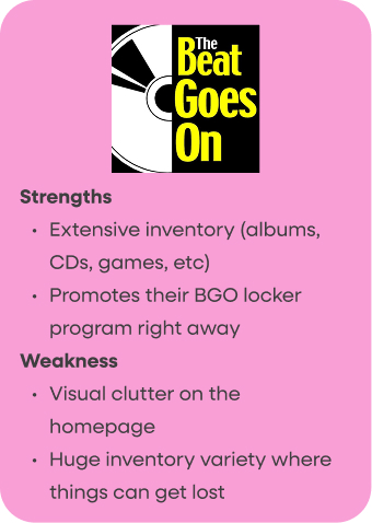
Original Website
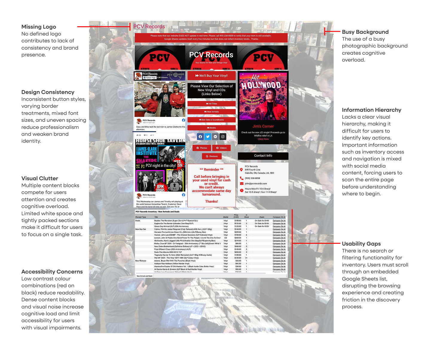
Overall, the original website lacks clarity, visual cohesion, and efficient inventory browsing tools. While the store has a strong physical presence, its digital experience does not reflect the same level of curation or usability.
RESEARCH & DISCOVERY
Competitor Analysis
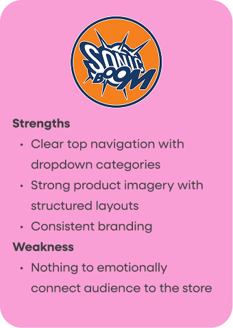
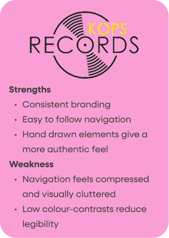
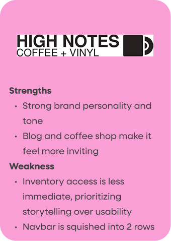
I analyzed four other independent record store websites to understand industry patterns in visual design, navigation structure, and inventory presentation. The goal was to identify opportunities for PCV to differentiate itself while meeting user expectations.
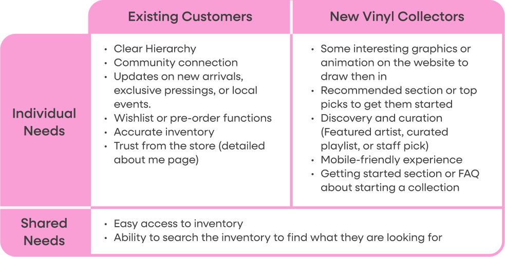
User Needs & Target Audience
I outlined the stores two main target audiences along with their individual and shared needs within the redesign.
INFORMATION ARCHITECTURE
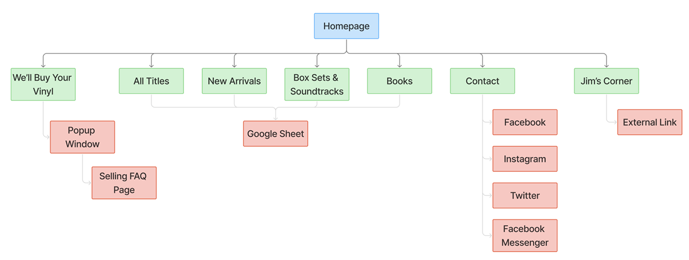
Sitemap
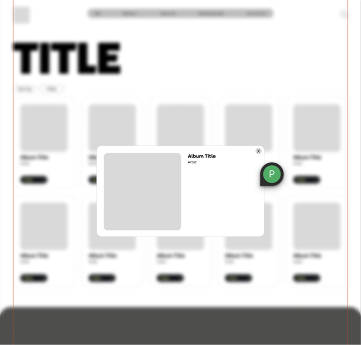
The original sitemap created a broken experience by opening a new page for nearly every interaction and directing users to an embedded Google Sheets document to view inventory. This disrupted the flow and made browsing inefficient.
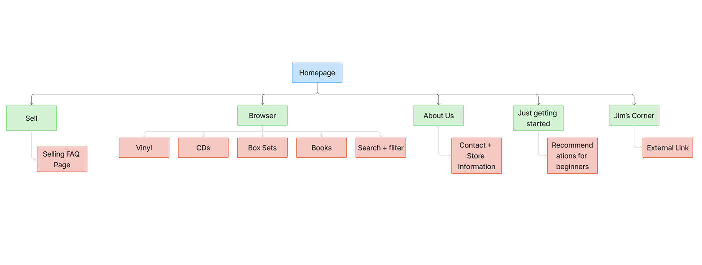
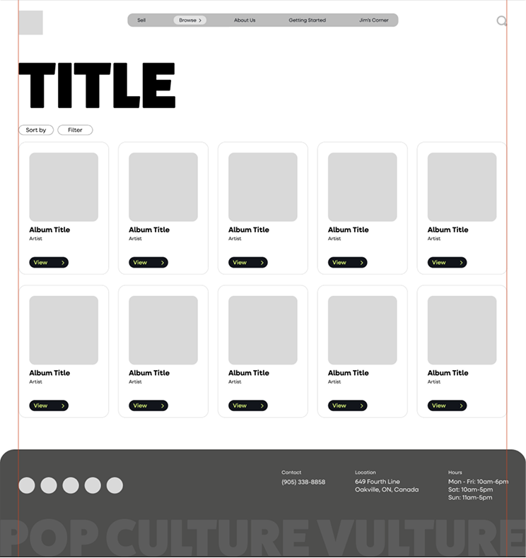
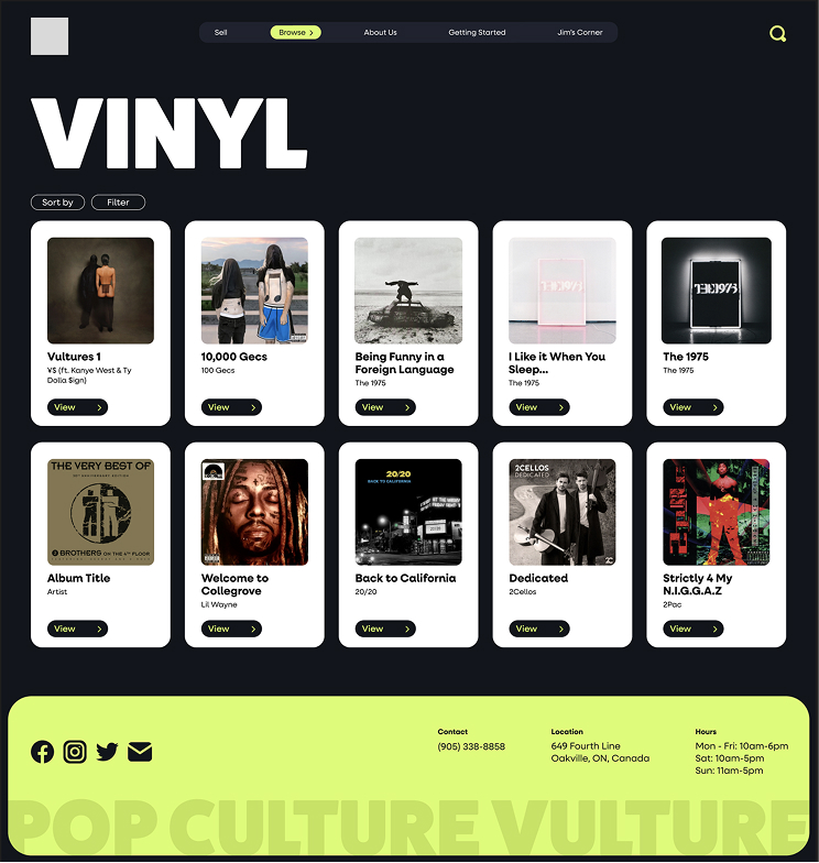
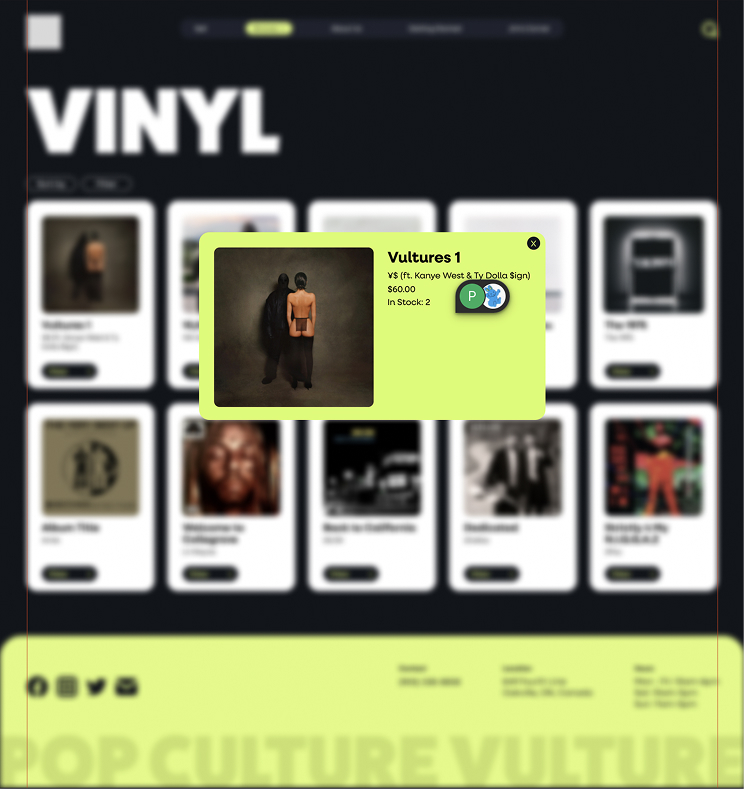
The redesigned sitemap introduces a clear, consistent navigation system and structured inventory categories, allowing users to browse seamlessly without leaving the site’s core experience.
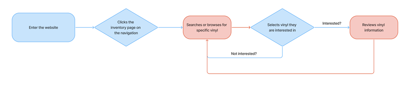
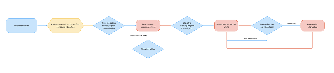
User Flow
Jaine and I developed separate user flows for our new target audience, existing and new vinyl collectors, to reflect their different browsing behaviours. Existing customers prioritize efficiency and direct access to inventory, while newer customers rely more on discovery, curation, and guidance. Designing for both flows ensured the final experience balanced functionality with exploration.
BRAND & VISUAL DIRECTION
Style Guide
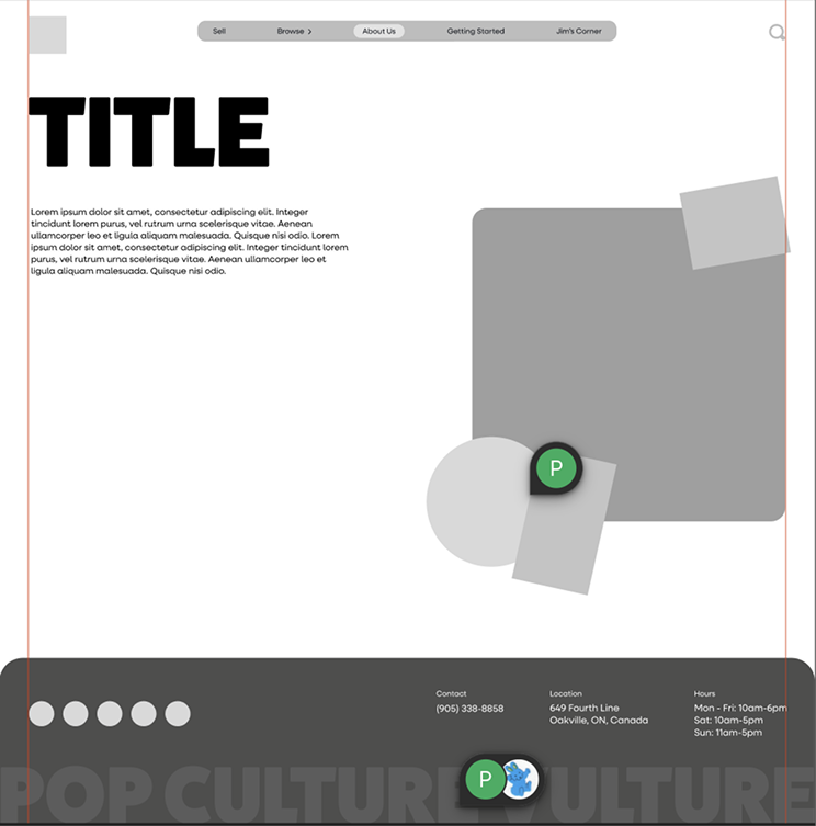
Our visual research revealed that many record stores rely on red colour schemes paired with black and white. To avoid blending into an already saturated market, we intentionally selected a vibrant neon lime green as PCV’s primary accent colour. This decision differentiates the brand while maintaining the bold, high-contrast aesthetic commonly associated with music culture. I also chose font pairings that are simple yet bold, prioritizing legibility while maintaining a strong visual presence.
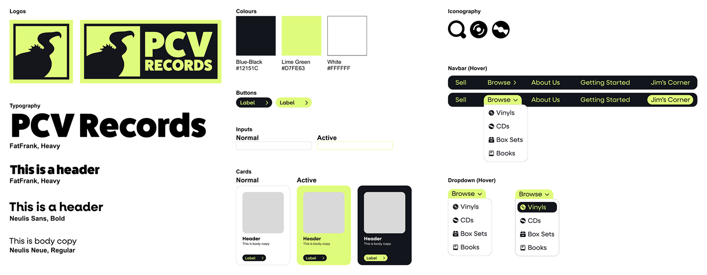
Logo Redesign
I developed a new logo to establish a stronger visual identity, as PCV did not currently feature one on their website. After conducting visual research and sketching initial concepts, I explored ways to incorporate a vulture, to reflect the name Pop Culture Vulture, while connecting to vinyl culture. Following internal feedback and refinement in Illustrator, I narrowed the concepts down and incorporated additional critique to strengthen clarity and scalability.
The final logo features a bold vulture head that directly references the brand name while maintaining a clean, modern aesthetic. I also created a simplified logomark version, which was used as a favicon and within the navigation to ensure consistency across digital touchpoints.
WIREFRAMES
Low-Fidelity Wireframes
The low-fidelity wireframes allowed us to test structural improvements and page hierarchy before committing to visual design. We reworked navigation, replaced the Google Sheets inventory with a browsable layout, introduced new pages for guidance and ensured key community elements were kept. Iterative feedback during this stage helped us refine layout decisions and reduce friction in the overall user flow.
High-Fidelity Wireframes
I analyzed four other independent record store websites to understand industry patterns in visual design, navigation structure, and inventory presentation. The goal was to identify opportunities for PCV to differentiate itself while meeting user expectations.
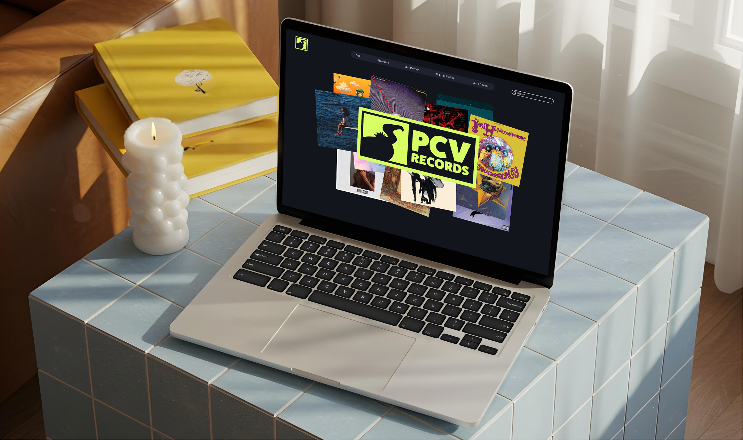
Final Solution
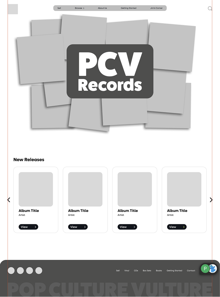
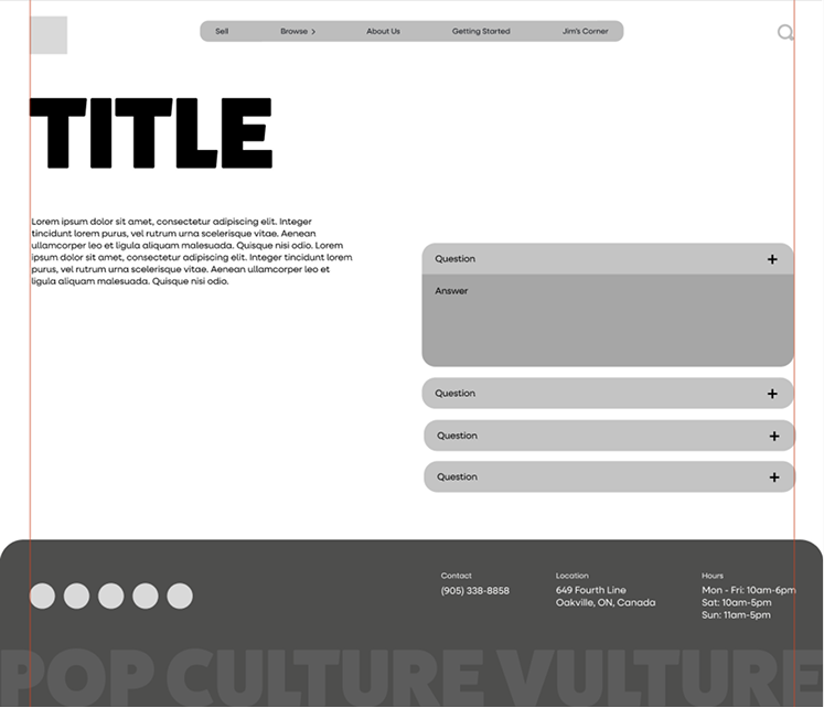
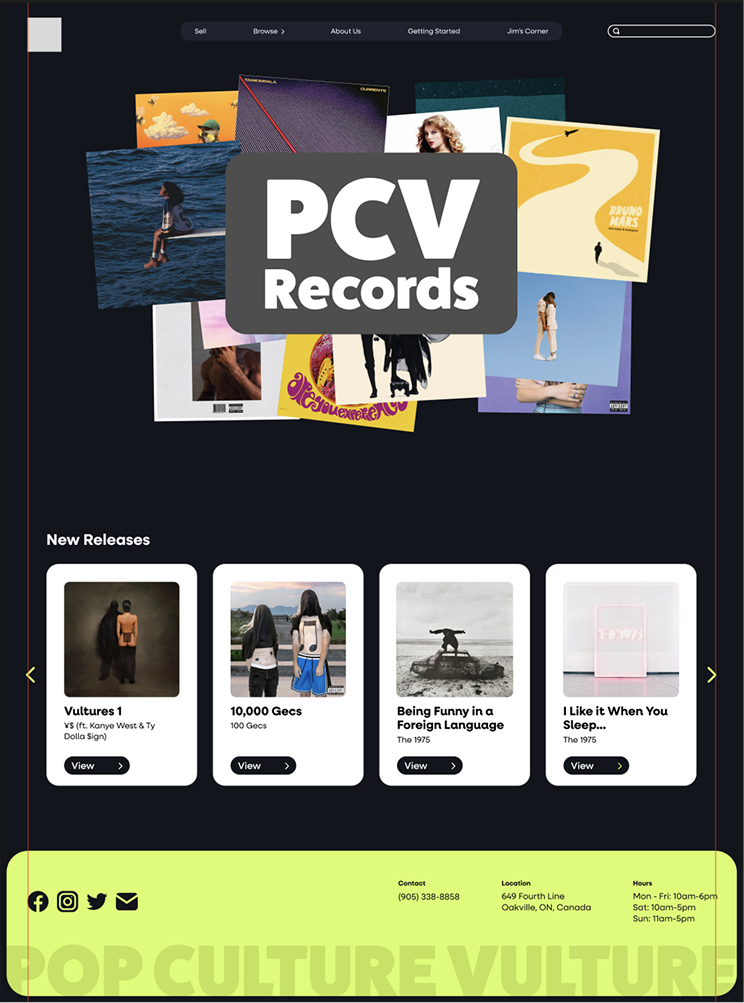
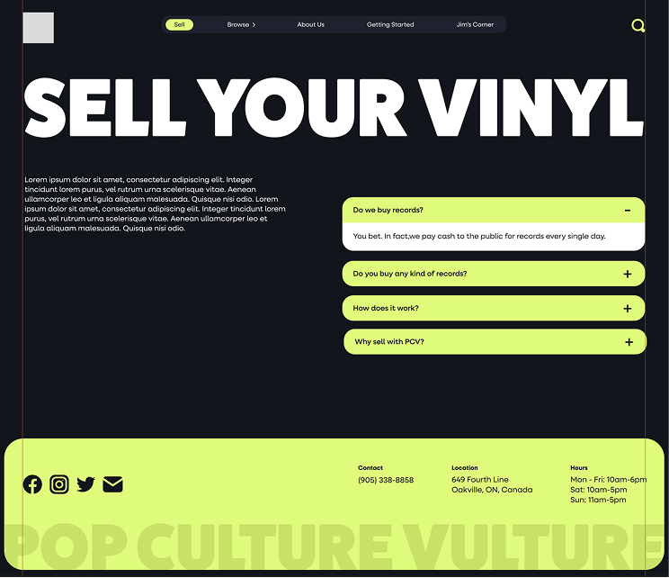
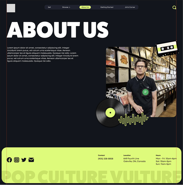
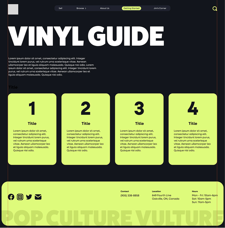
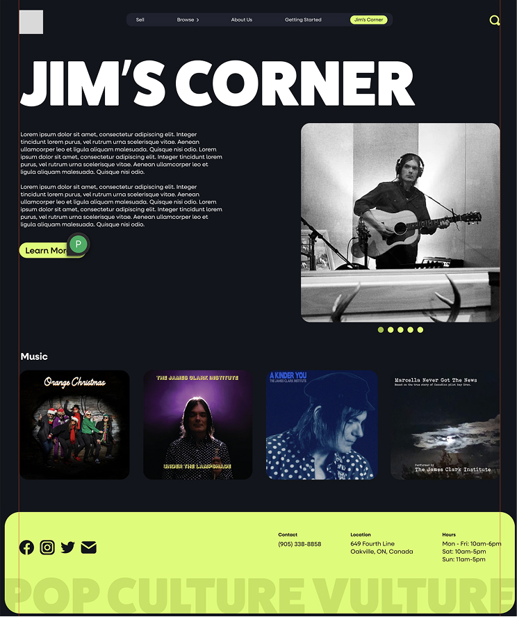
The redesigned website creates a more cohesive and intuitive digital experience for PCV Records. Clear navigation, structured inventory browsing, and improved hierarchy reduce cognitive load and make product discovery more seamless. Combined with a refreshed visual identity, the new platform better reflects the store’s personality while supporting both experienced collectors and new vinyl buyers.
Final Thoughts
This project challenged me to think beyond surface-level aesthetics and focus on systems. Analyzing the original sitemap and rebuilding it helped me better understand how structure directly influences usability.
I also learned the value of intentional distinction. Choosing to move away from common red-heavy music branding pushed me to consider how visual identity can shape perception and differentiate a brand within a competitive landscape.